


Cull Your Darlings
Why Some of My Favorites Had to Go

As I wrap up production on Someplace to Be, I thought it would be fun(?) to share a few photographs that almost made it in the book. I shot a lot of photos for this project, and these are some of the last ones to get cut during the final edit. I will spare you from looking at the thousands that were not good at all, were never considered, and should probably have been deleted in camera.
OK, some of these were/are hard to let go, while others, less so. Feel free to tell me I made a mistake and that one or more of these should have been included. I’m confident in my choices, and the mere mention of a possible oversight won’t send me into a spiral of doubt and second-guessing.
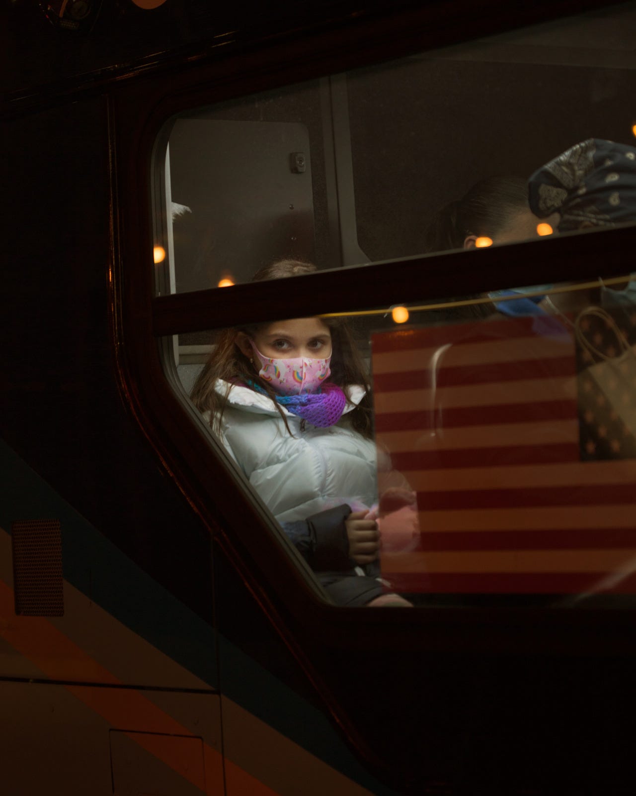
This one was a tough because I really like it. I love how she’s framed between the flag and the window, and the color and pattern of her mask and scarf. The mask has rainbows and unicorns on it, which just guts me. I have such a vivid, oddly powerful memory of trying to find cute masks that my daughter would like. It felt so sad and absurd and I think I’ll remember it forever.
In the end, though, it was the mask that made me leave this photo out. I didn’t shoot much of this series immediately after Covid, and when I did it was because I felt like I should document it, but the masks really stripped away a lot of the personality in the images. Not so much in this one, because her eyes and that sad charm still come through. I decided to make the book a pre-Covid document, because almost all of the images were shot before, and I feel like the masks take you out of the world I am trying to create.
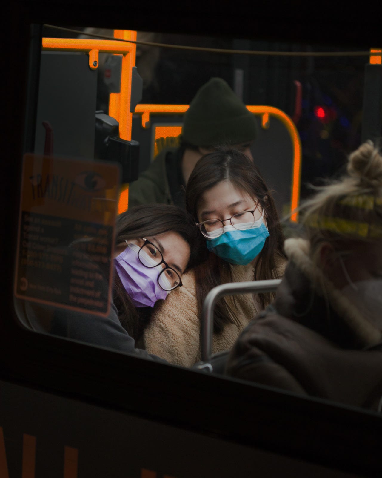
Here’s another example. I like how you can tell the girl on the left is smiling at me. I love them and this moment. Another hard one to lose.
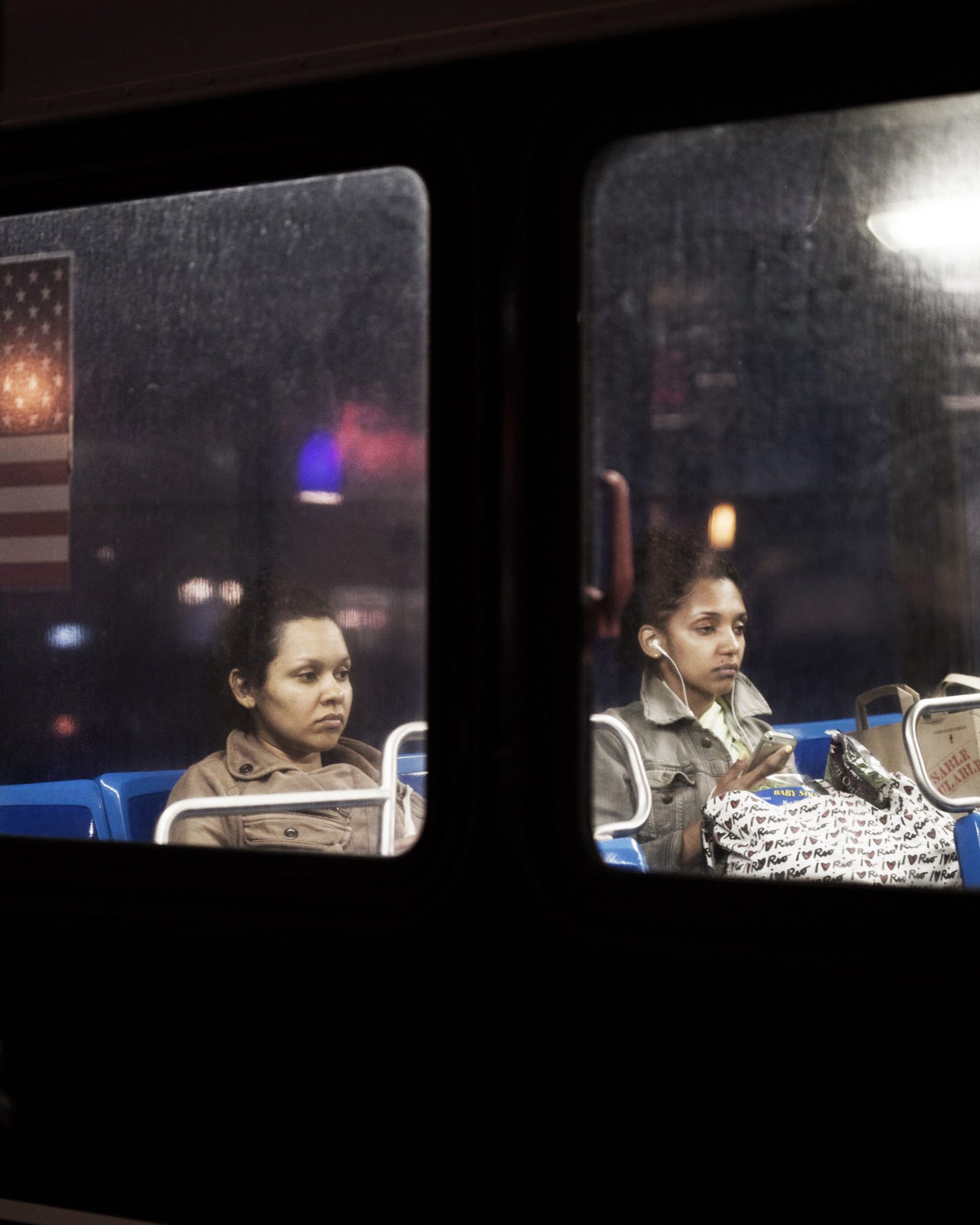
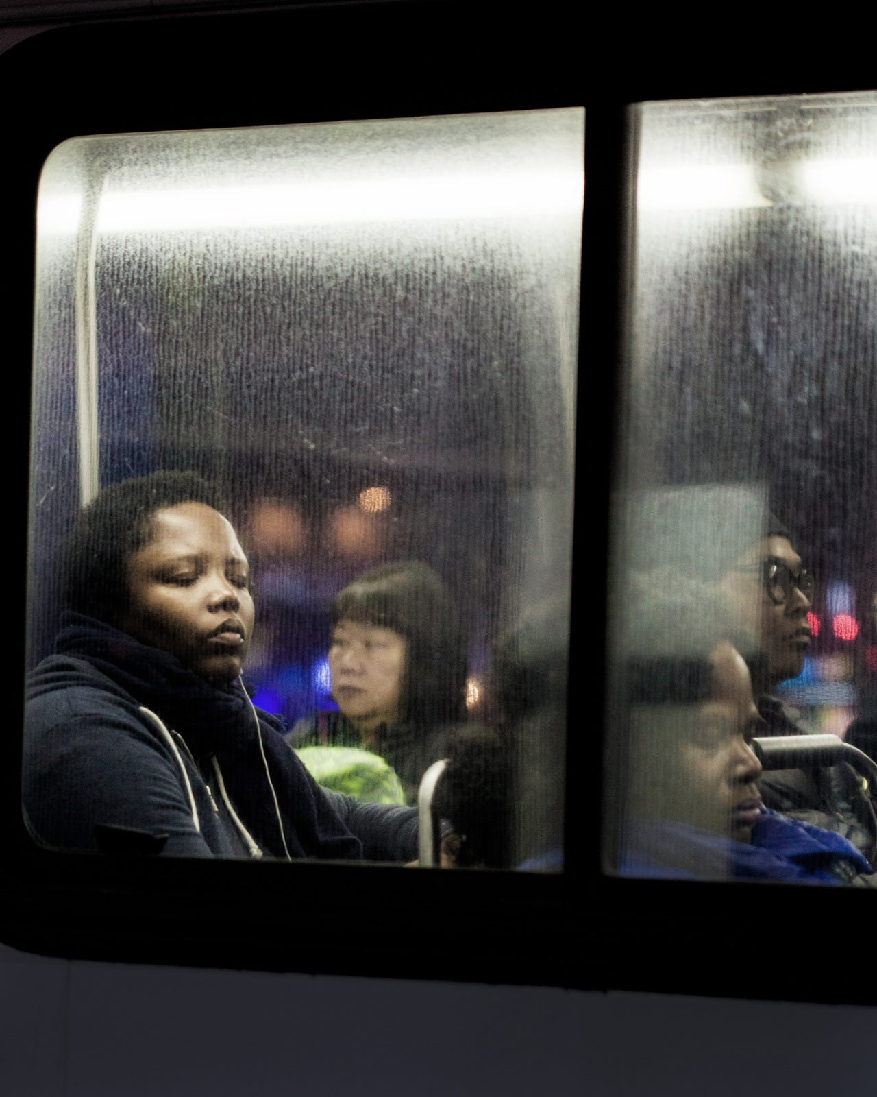
I was drawn to how similar these two women looked. I noticed it immediately and was surprised when it began to look like maybe they weren’t sisters sitting together. I think they were actually strangers, which makes it funnier to me. They are both executing the “I am on the bus” face perfectly. This one just didn’t quite measure up. It has the flat lighting of the newer buses I don’t like, and that is why it didn’t make it in.
I have been thinking about what will date these photos eventually, and the most obvious answer is the all of the white headphone wires. This is before most people went wireless.
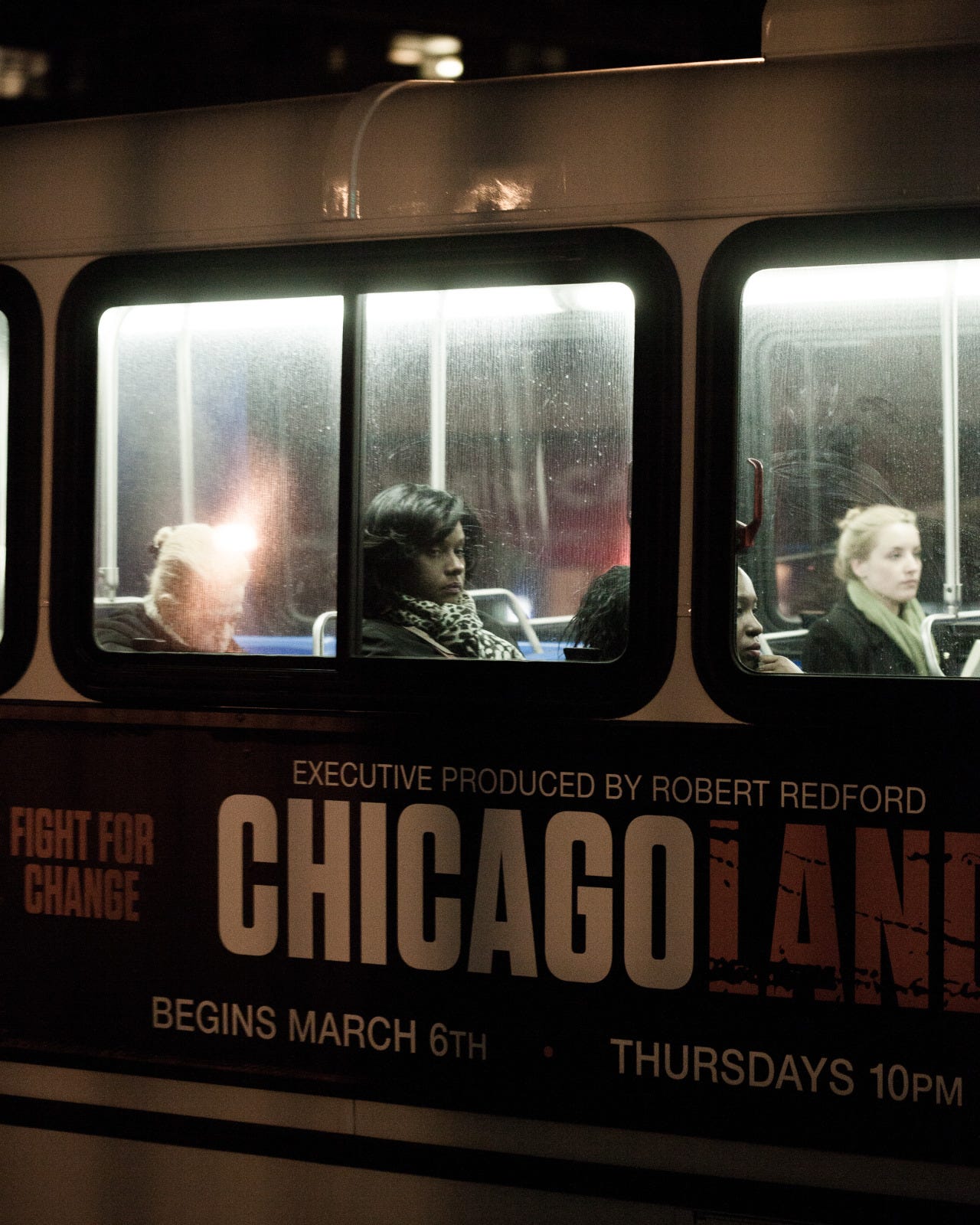
I like how cinematic this one is. The text is dramatic, and adds to the photo, which isn’t always the case, it is often distracting. The reason this one didn’t make it in is that I just missed with the focus a little too much. It might be hard to tell here, but it does not print well. If she was sharper, it might be a different story. Also, if I’m being honest, if it said NEW YORK CITY instead of CHICAGO, I might have overlooked the focus.
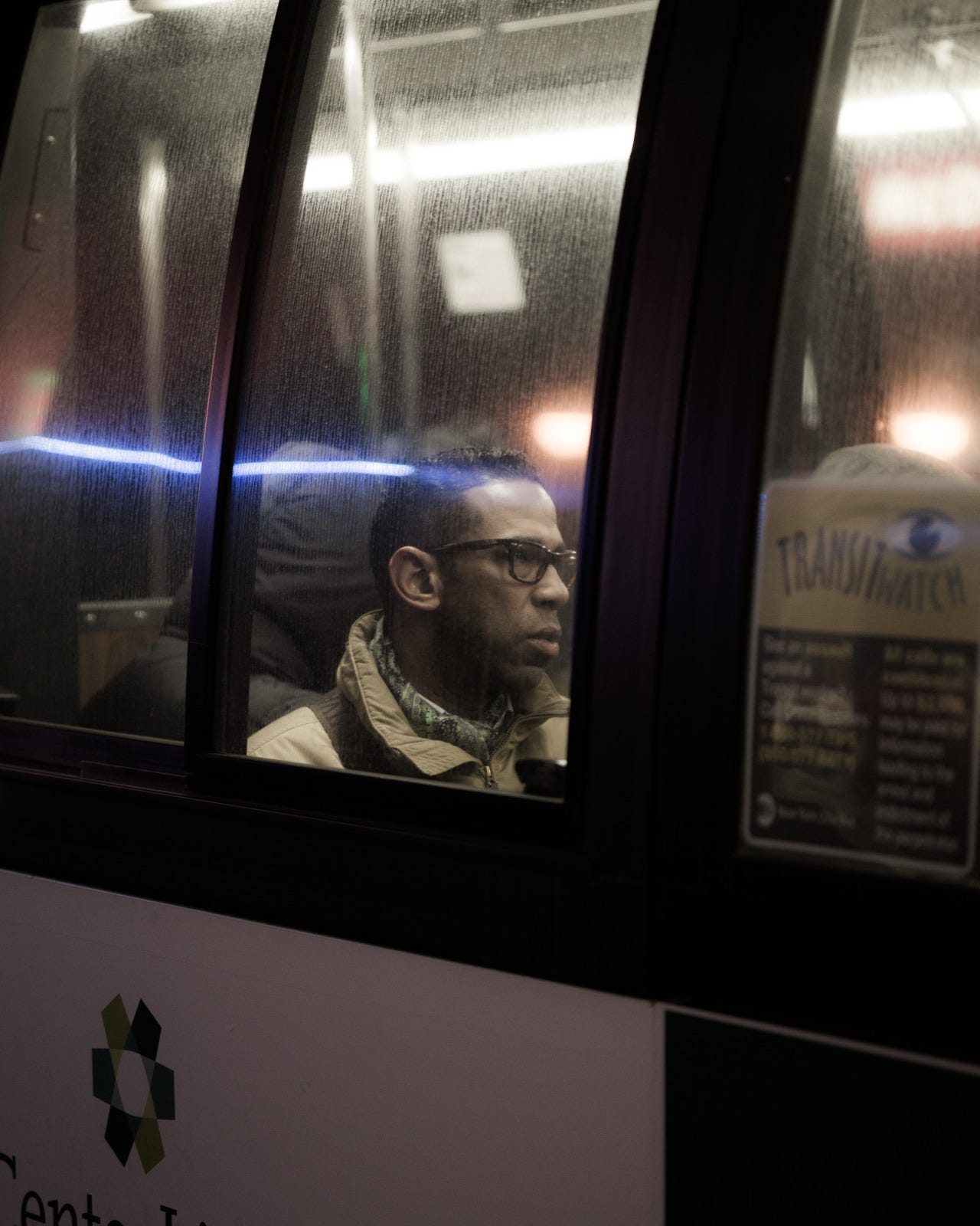
I like this one, but it always feels like I missed the moment, like I was a second too early or a second too late. I caught him in an in-between place that feels a little unsettled, if that makes sense.
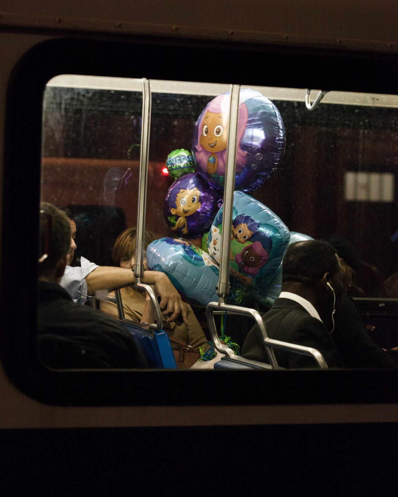
I held onto this one for a while because I thought it was fun, and I liked the idea of including a few images that are of something rather than of someone. But this one always felt like it needed a person to anchor it.
I did include one photo that's of flowers, rather than a person, but since they’re clearly being held by someone, it felt more connected.
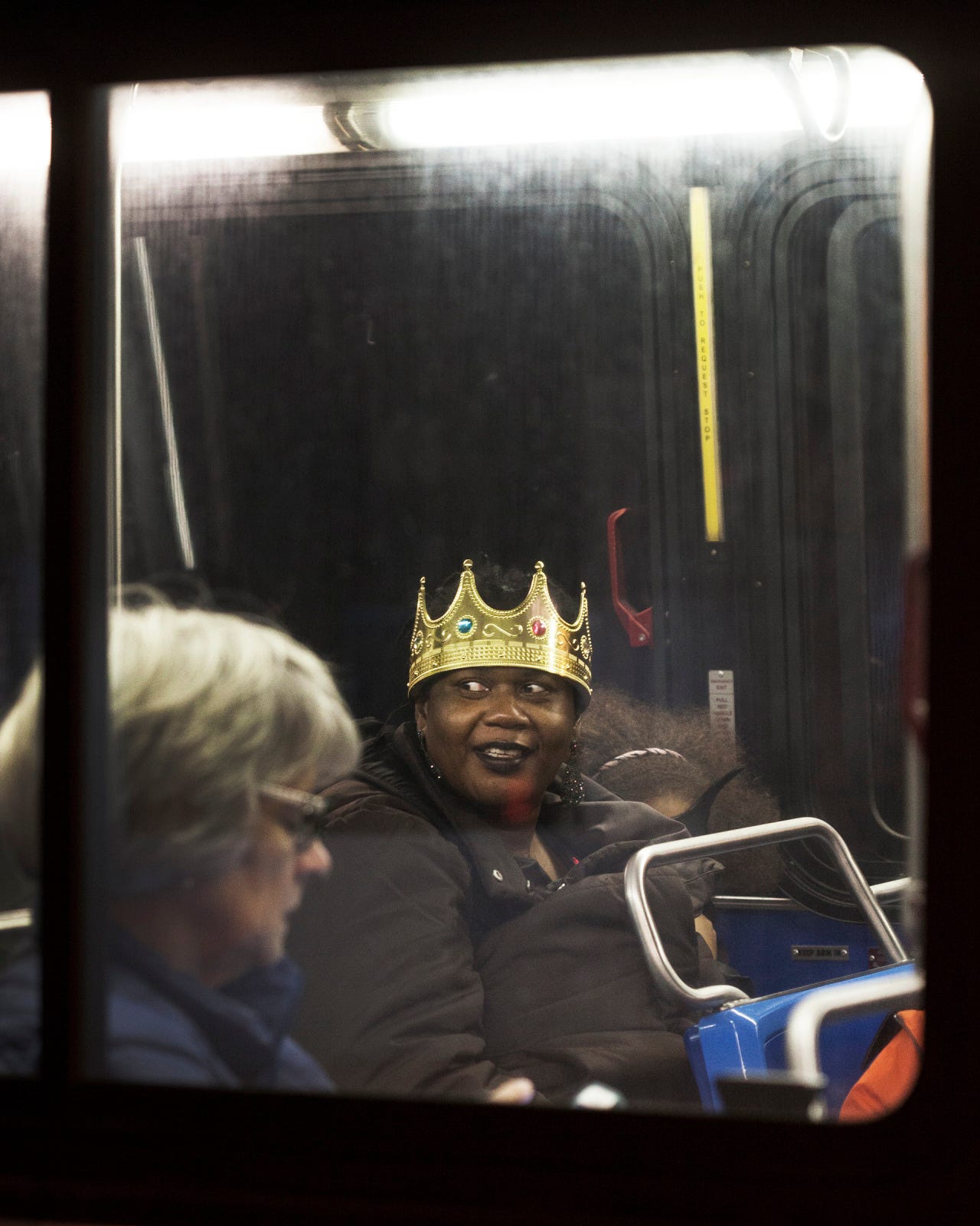
This one was almost included because THAT LADY IS WEARING A GOLD CROWN. In the end I cut it because I have a photo of the woman in the foreground that is one of my absolute favorites, so this one had to go. Also the little girl next to her mom was wearing a cool mask, and I completely missed her, so that annoys me. I shot a lot on Halloween.
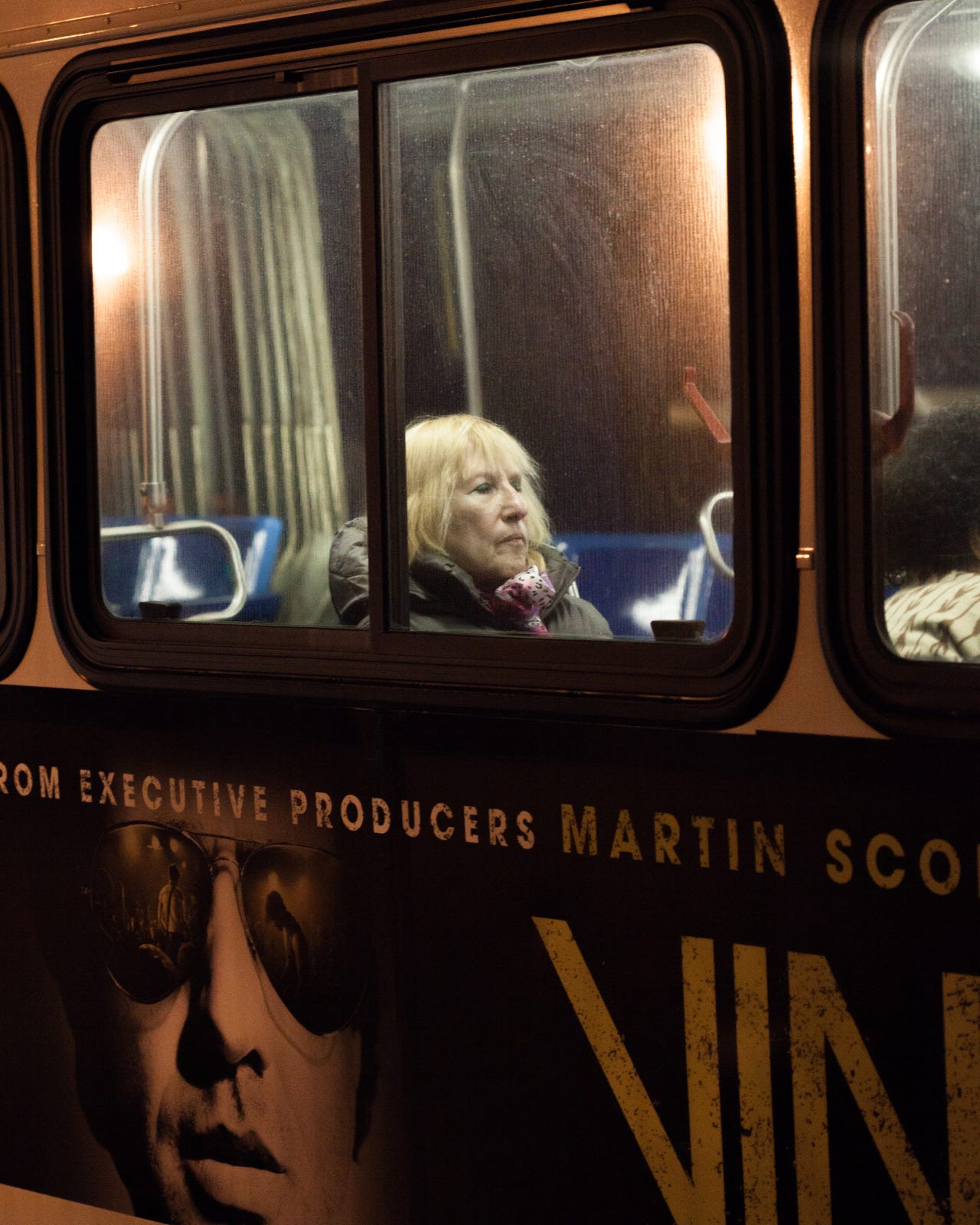
I almost like this one, but if you zoom in, her eyes are not quite closed and it’s all I see when I look at it. Some of my favorite photos are of people sleeping or resting with their eyes closed, but in this case, I think it was a blink, so it didn’t work.
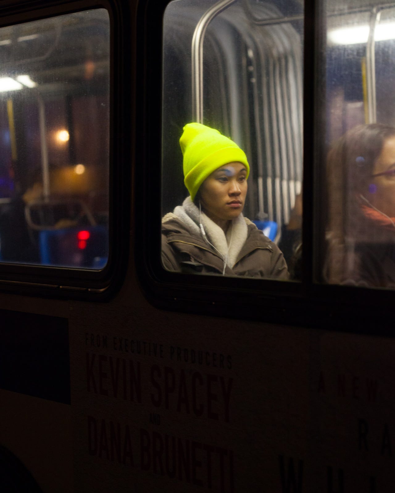
I love the color of the hat, it was glowing and I saw it from a block away, but I missed with the focus. I was often rushing to catch something before the bus (or passenger) moved, and I’d get the focus on the glass, and not the person.
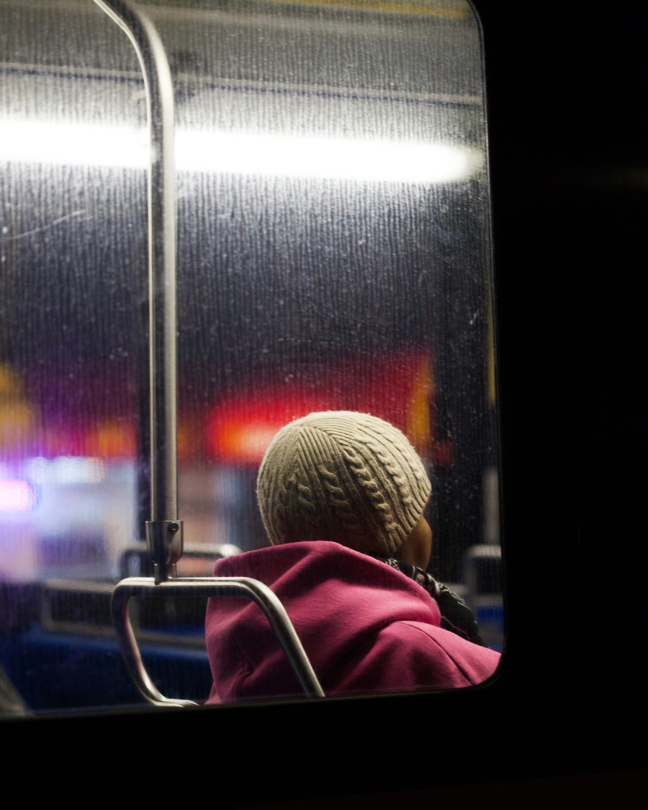
The mix of colors and textures made me like it, but in the end it’s just a photo of the back of her head, and for that to work it needs to be very special in other ways.
I still love the colors of the background and wish I got something in that spot.
This one didn’t quite make it, and now that I’m looking at it I’m not sure why (other than the book can’t be 1000 pages long). Look at the light on her face! Shit, this might have been a mistake.
OK, that’s probably enough, right?
There are a few more, but I think you get the point. I’m glad I was able to share a few of these here, it takes some of the sting out of not including them. I can’t wait for people to see the whole thing.
Thanks, Travis
While writing this I was listening to:
Congrats on pushing through to the end of the project! A lot of work gets done that’ll never be seen, culling is just a part of it.
I’m curious, how did you decide on a final number of images for the book? Did you simply include all your favorites or did you have some pre-decided limitation?
For me the second is great but the first doesn’t have what it’d need. Just a question, I guess you somehow processed them because color mood is very uniform, so couldn’t do something with that flag to be really that? Also, for the rest perhaps the crowned woman could do it. At the end once done just carry on (I feel poet today)