

People Choice
The photo series you have all been waiting for.

If you’ve read this post, or follow me on Instagram, you probably know at least a little about People Choice Pharmacy Inc.
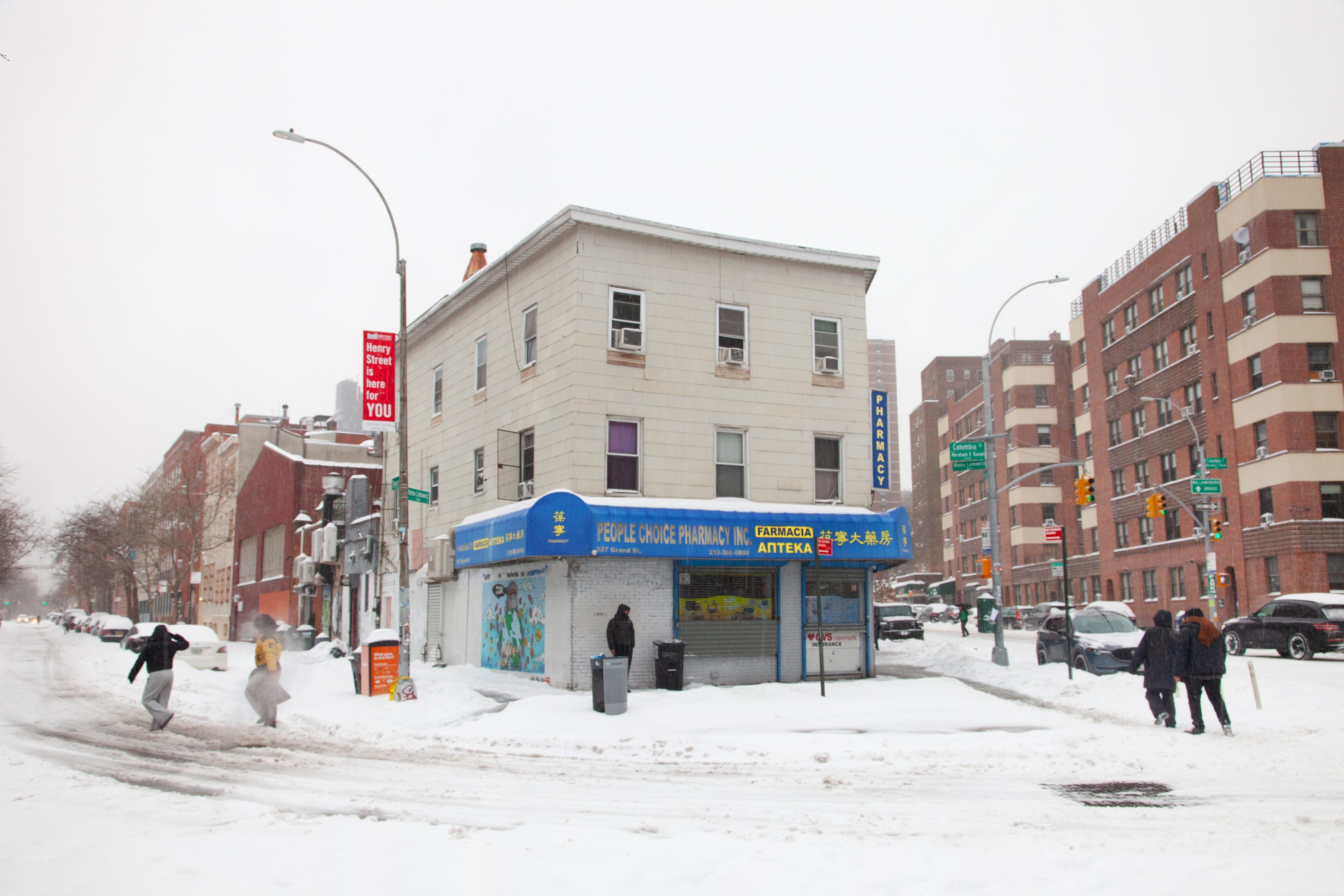
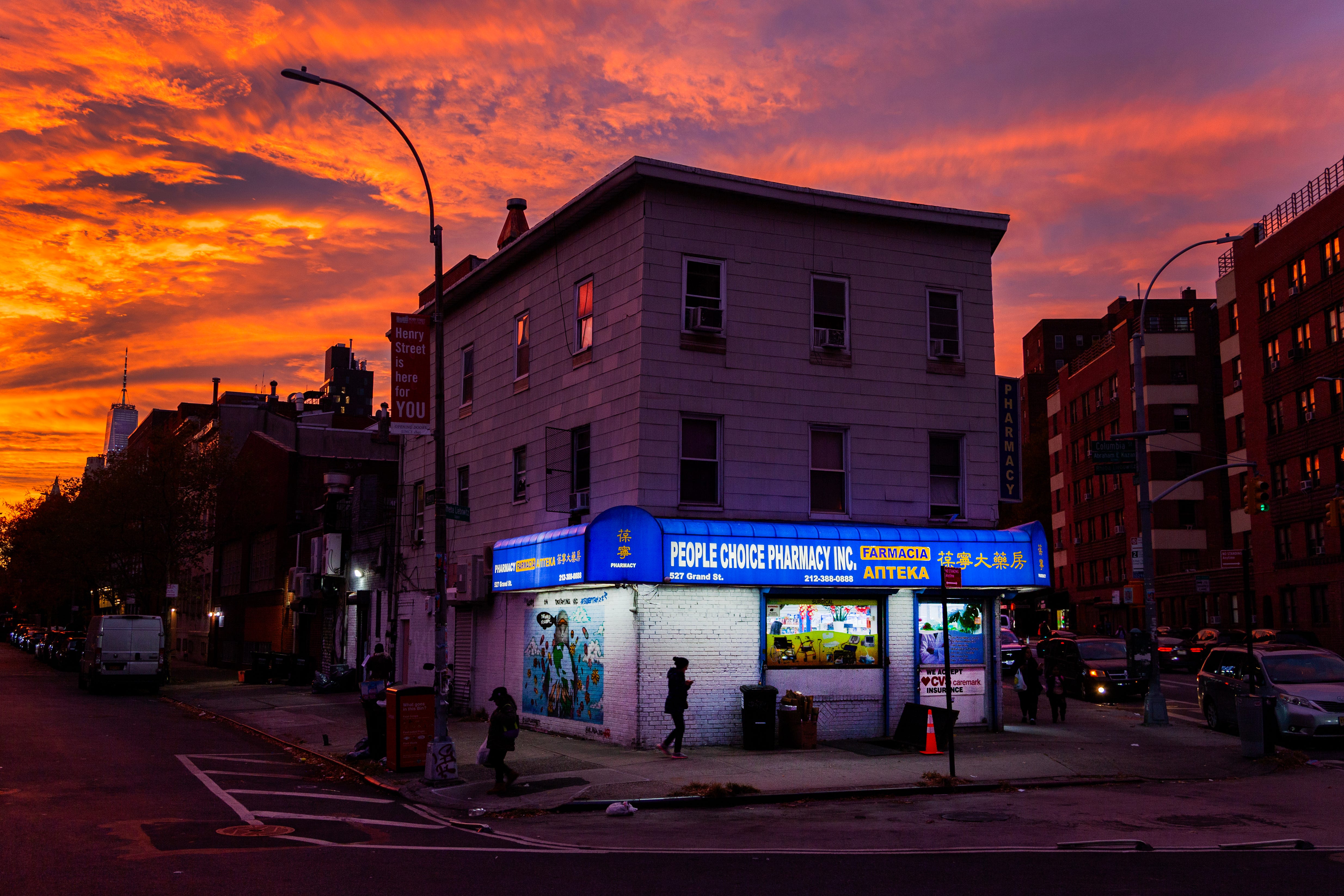
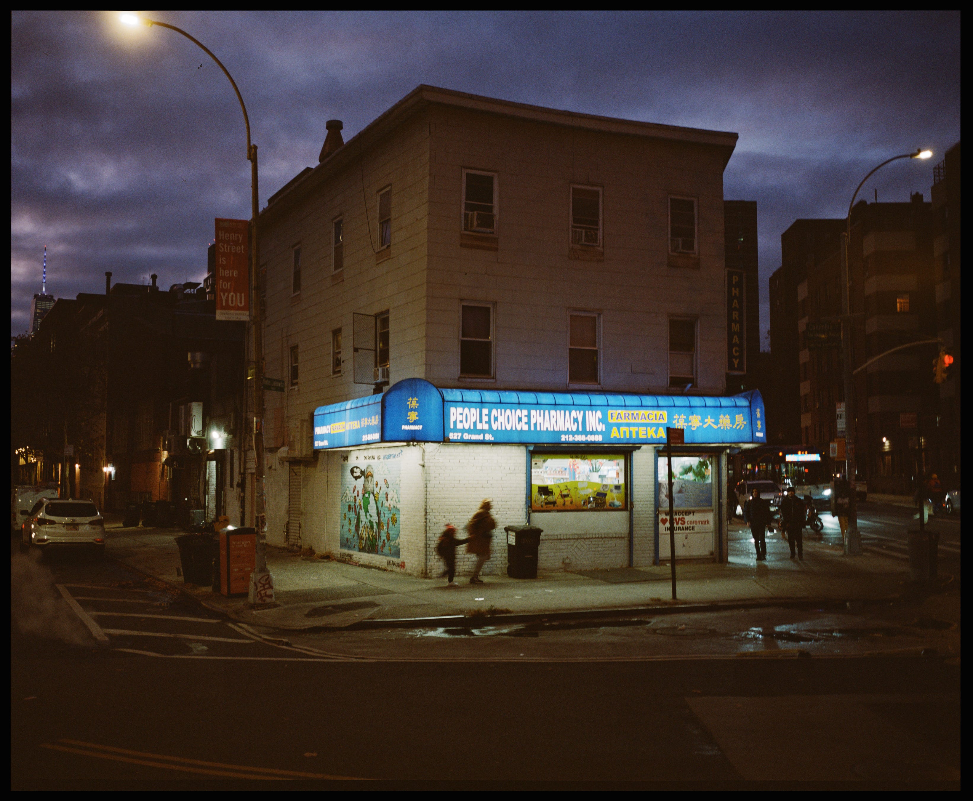
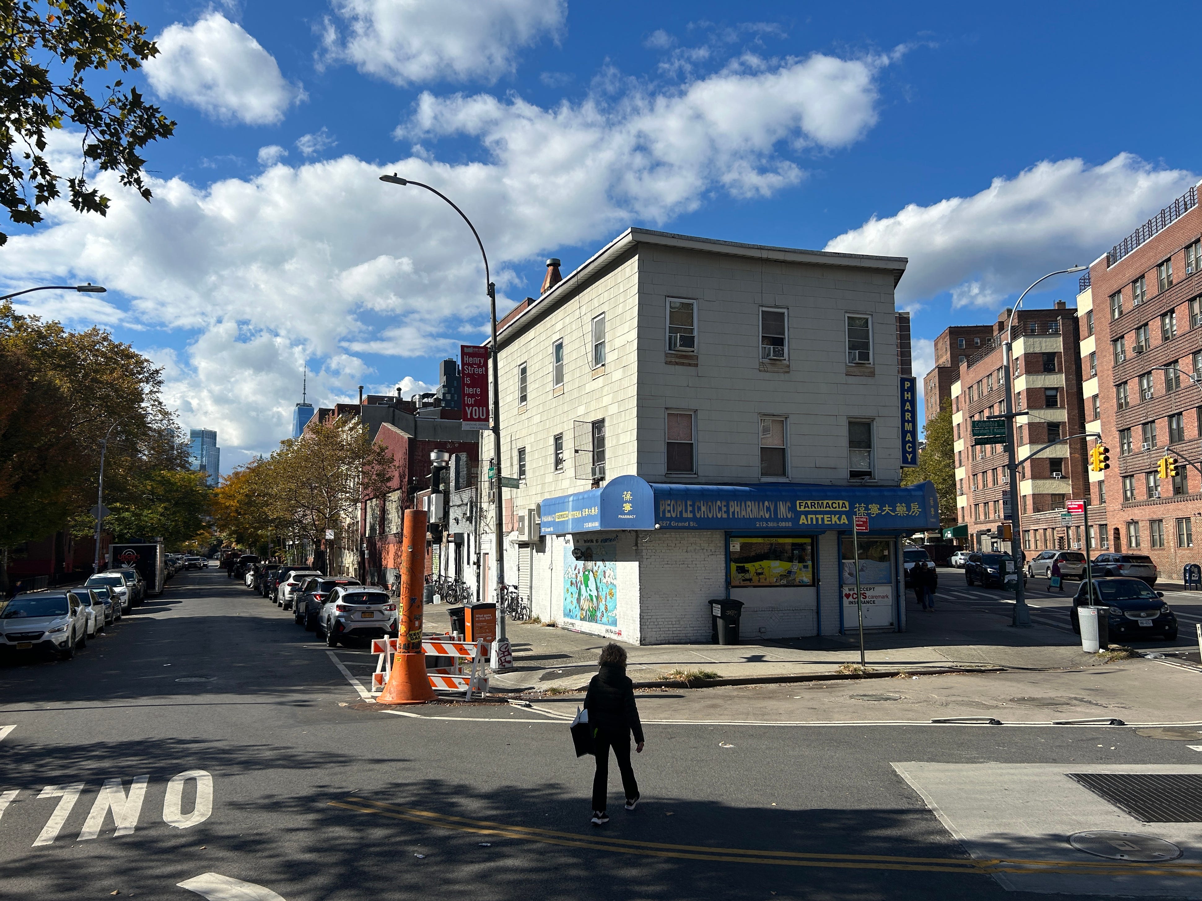
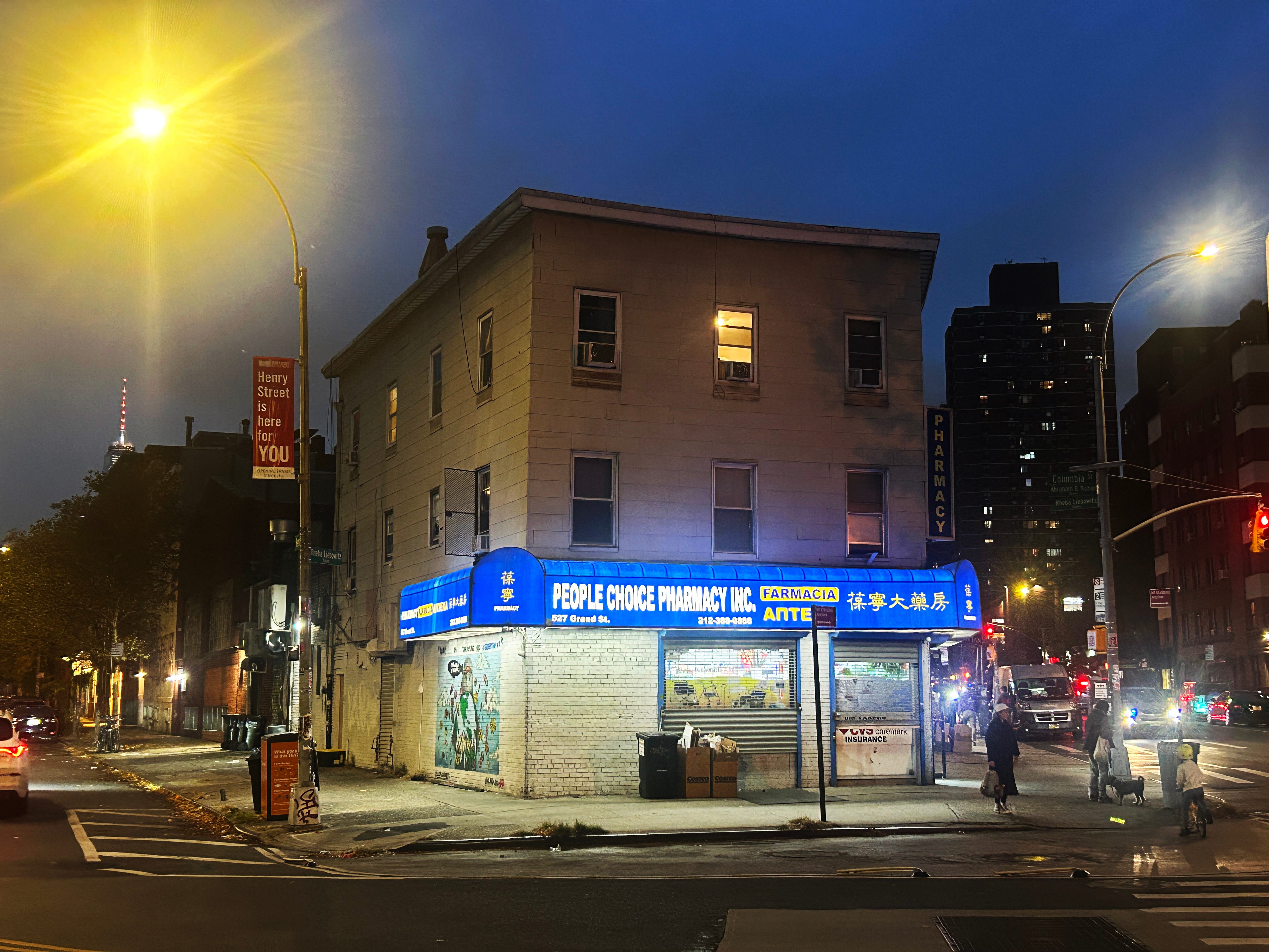
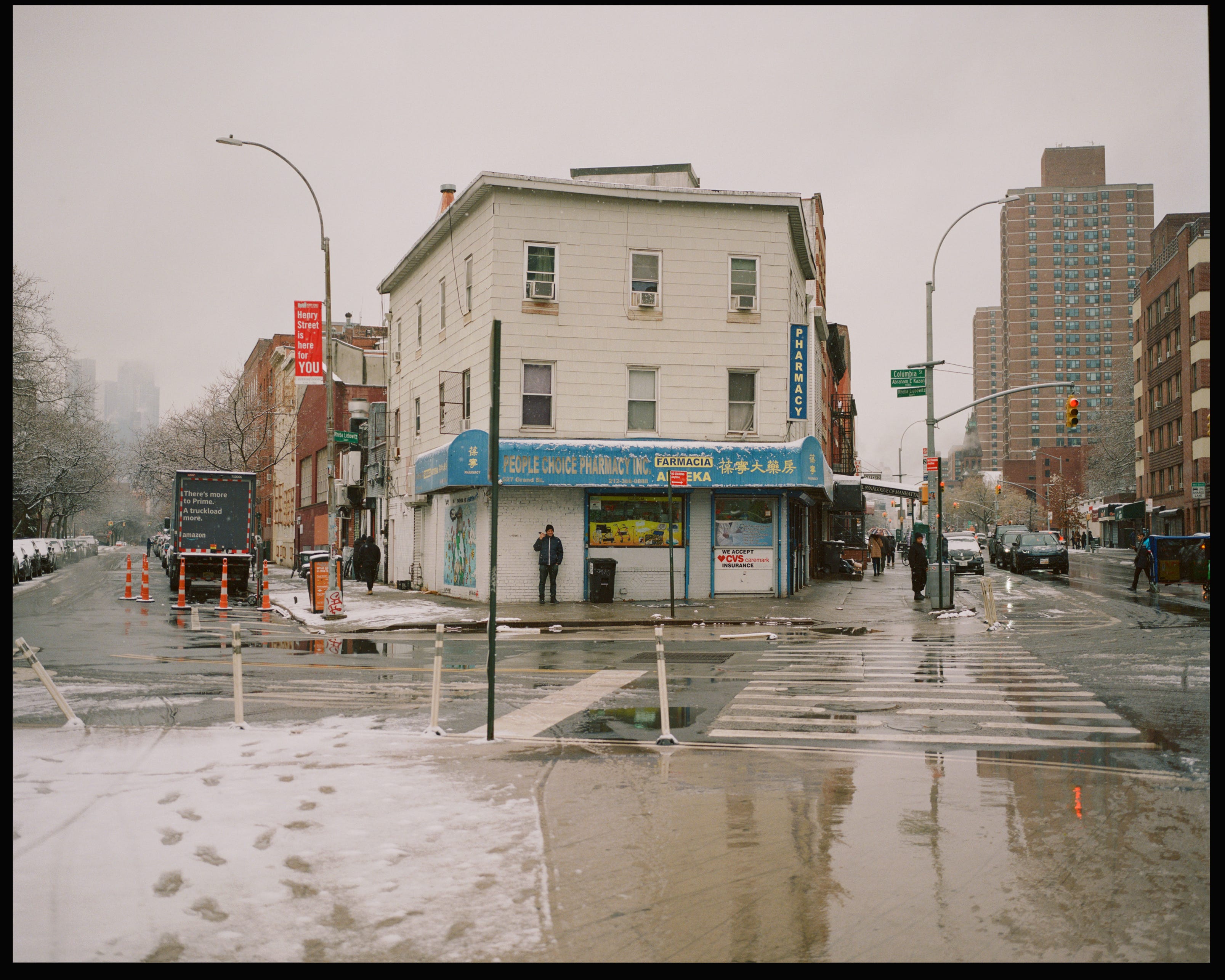
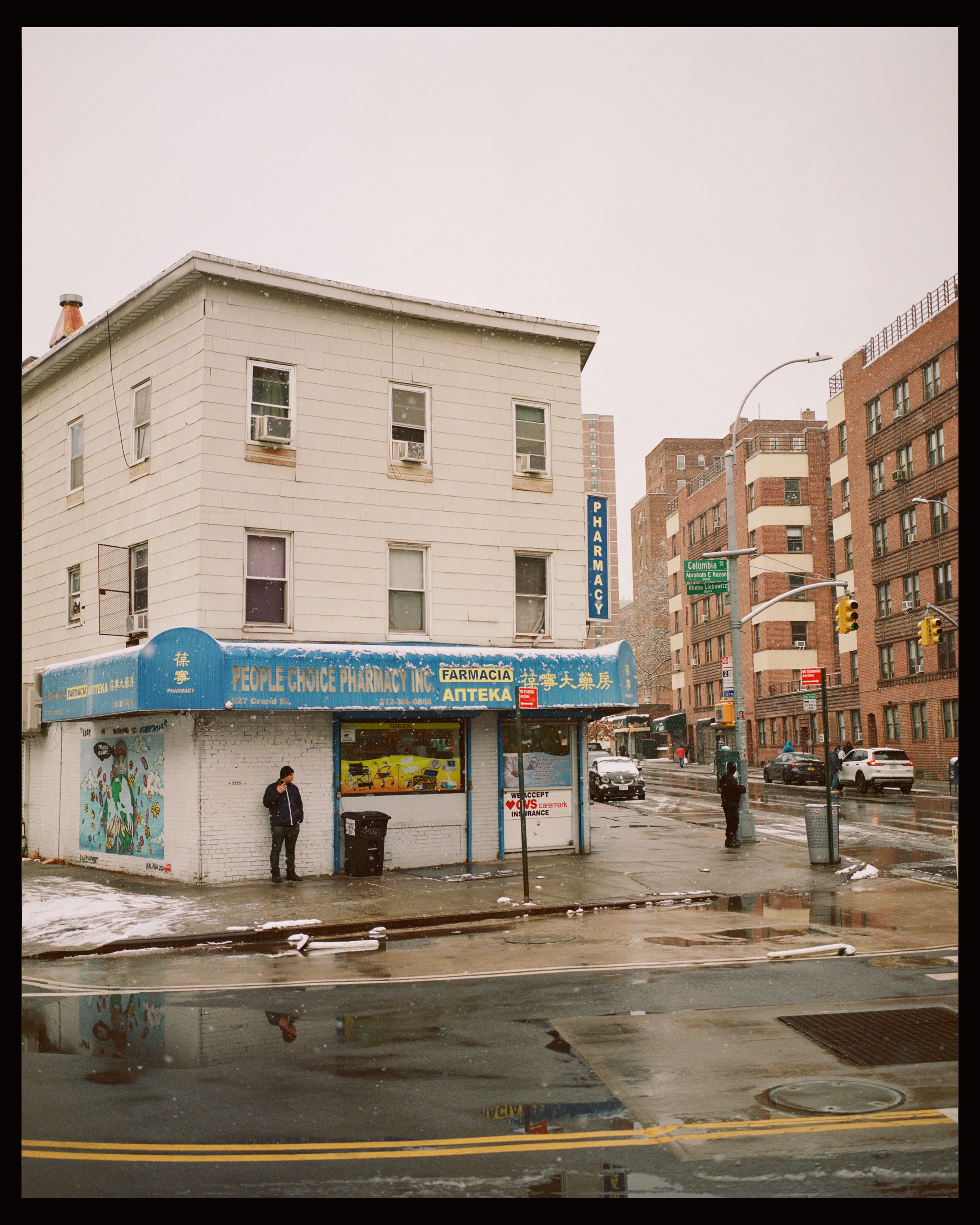
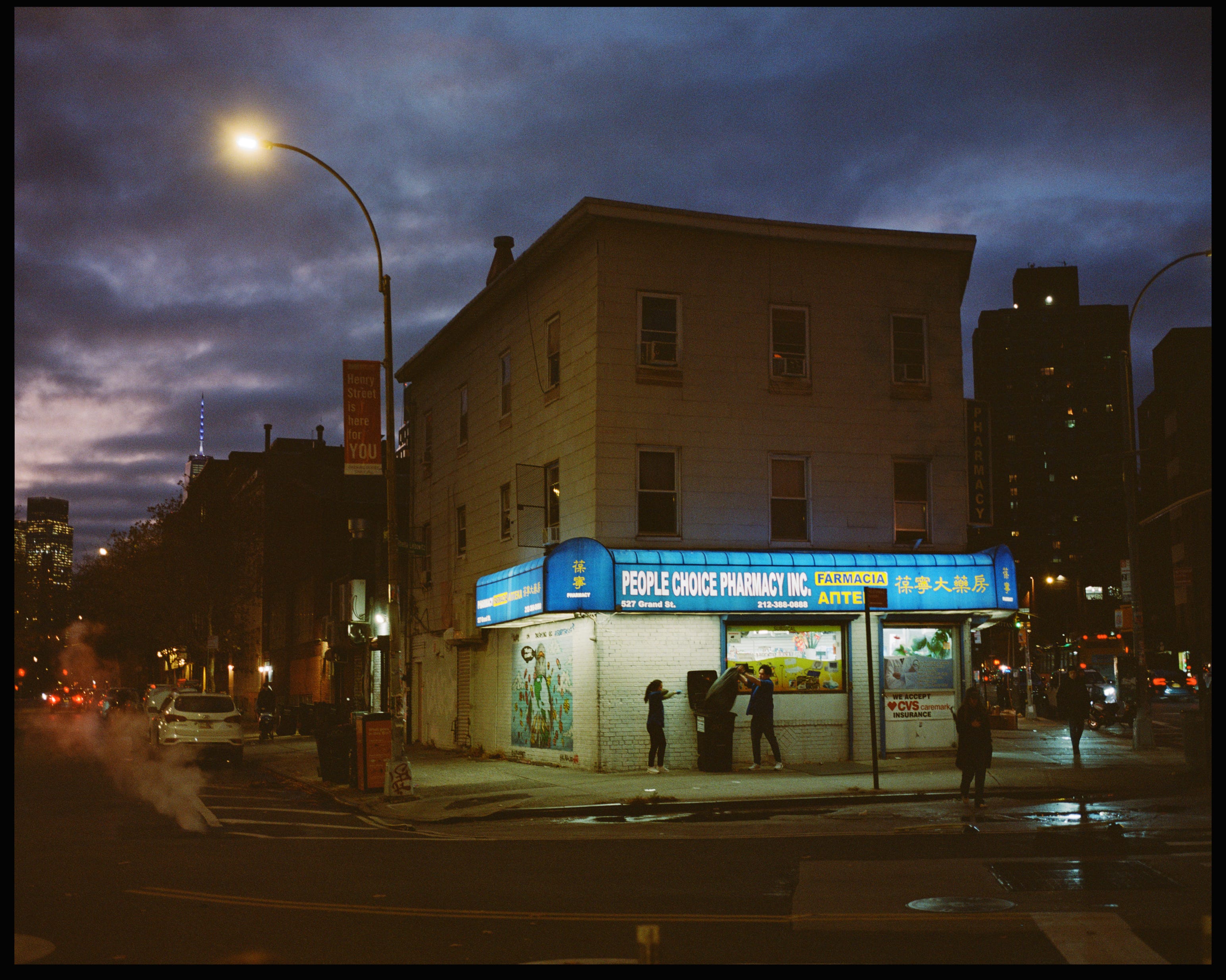
It sits on a narrow, angled corner where Henry Street and Grand meet on the Lower East Side of Manhattan—a kind of sad little Flatiron building, but one I like very much. I’ve always been drawn to these odd corners; they force interesting architectural choices, like this funny little trapezoid of a building. I pass it once a week when I take my daughter to dance class, and I started photographing it as I walked by. Eventually, I began going out of my way to visit it with a camera. Here are a few of my favorites.
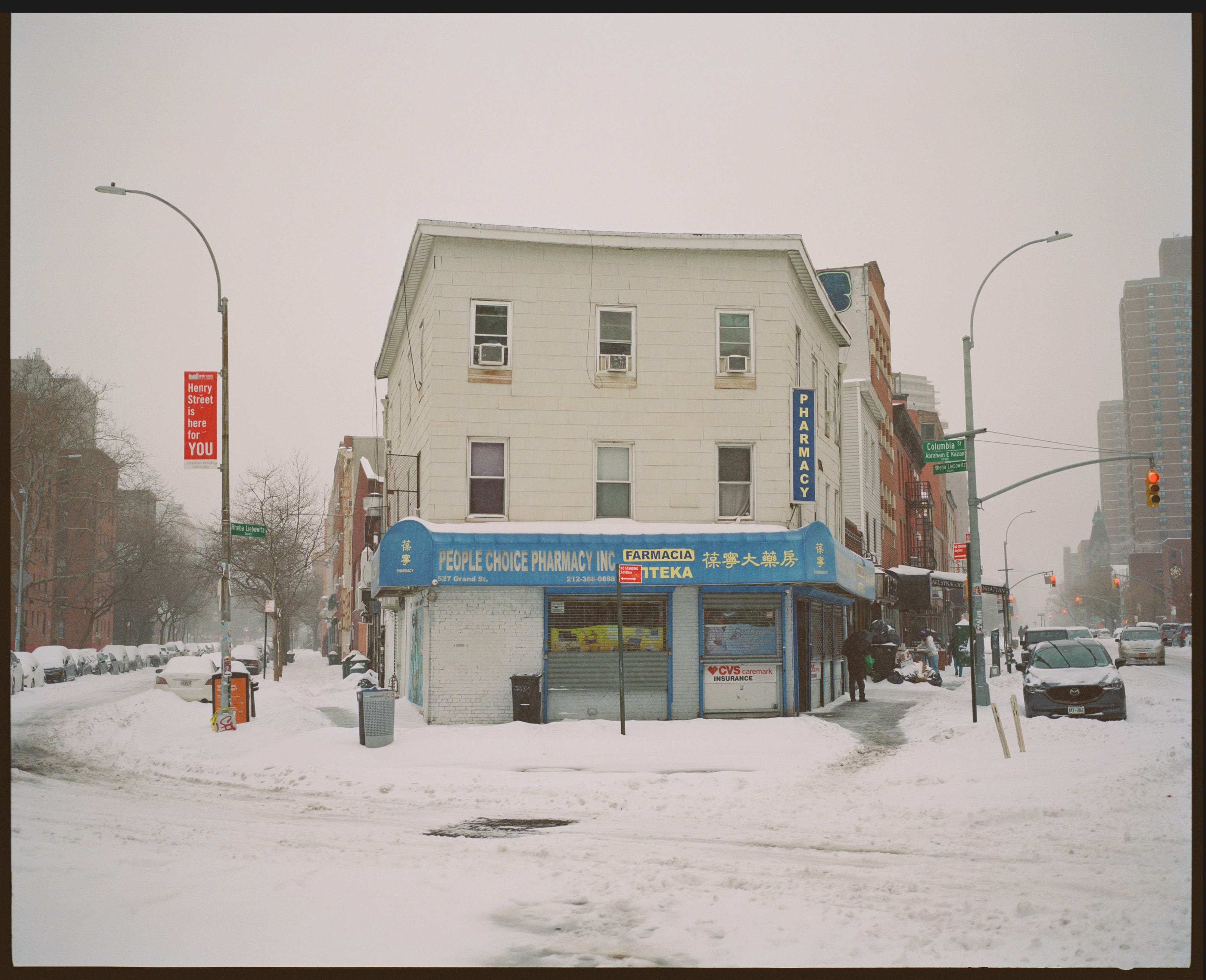
I think I’ll probably shoot keep shooting the People Choice. I’m looking forward to seeing how it looks in the summer, or in the fog. If you subscribe to me on here, you’ll probably see those someday, unless they are bad.
Thanks, Travis
While writing this I was listening to:
Cool!
And I didn't even notice until the end of your post that it wasn't "People's Choice"
The burning question I want to know the answer to is why People Choice and why not People's Choice? I love flat irony architecture choices too.